
Plex for Google TV Gets Home Screen Overhaul
Plex for Google TV has been updated with a fancy new look. The app’s home screen has been overhauled to make moving through media categories and finding new media easier. The new home screen also makes it easier to access the most recently used online content channels. Plex has always had a clean look and the new Google TV home screen appears to do a nice job of exposing more media at the top level without cluttering the screen. I hope we will see this new, more refined look extend to other Plex clients in the future. As always, Plex for Google TV is available through the Android Marketplace. The Plex team is promising that the new home screen is just the first in a series of updates coming to the Google TV client. Any thoughts on what you would like to see next?
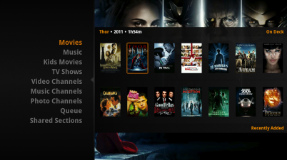
The home page is divided into two parts – on the left are the movie, TV shows, photo and music sections that you added to the media server during setup. You’ll also see sections for recently used channels, your myPlex queue as well as sections others are sharing with you. The right side will show you details as you flip through items on the left. Plex shows you the most important information from each section so that you spend less time looking for media and more time enjoying it.