
Visualizing workout data
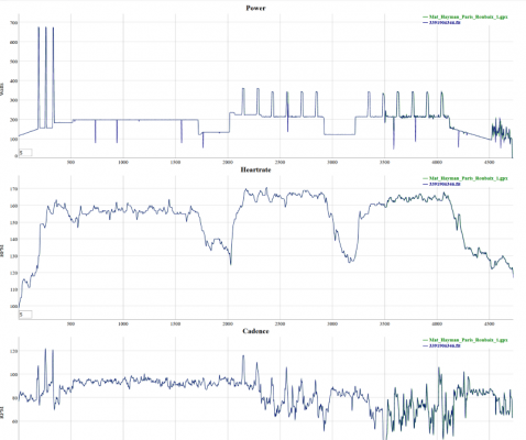
I’ve been looking for a better way to visualize the workout metrics produced from my bicycling computer than the tiny graphs that Strava provides, but I didn’t find anything that quite suited my requirements. So, I built something, and would love it if I could get some help testing it out.
Usage is simple, drop the files (GPX, TCX, FIT) you want graphed on the page. If there is more than one, data across files is currently only aligned by heart rate (which obviously won’t work if you are comparing heart rate monitors), but I plan to add an option to align using cadence in the future. The application does not save any of the files for privacy reasons, all of the manipulation is done in memory.
Very much BETA at this point. Have a play and let me know either via email or in the comments any bugs/feature suggestions.
I’d test it, but I currently lack a HR monitor. Although I’ve had one sitting in my Amazon cart for months now.
1) if you have a file without HR data, that would be a good test. I have no idea what would happen there :).
2) GET A HR SENSOR! I wasn’t until I got HR/cadence data and a computer to show it to me that I was able to use cycling as a fitness tool. Data makes it so much easier to train effectively on the bike; mostly because you know the difference b/w good and bad hurt.
Let me see what I can get for you off Strava or Cyclemeter in the next day. I’ve been nursing a groin strain, so not a whole lot of riding as I’ve been trying to nurse it back to health.
I know , I know about the HR monitor. If I buy it, then I’ve gone full MAMIL and I’ve been in denial.
LOL, I didn’t know there was a special term for it! I am definitely a MAMIL :).
Worked well – sent you a screen shot. HR was just an empty graph. What are the units on the X-axis?
The X-Axis is sample count. Generally the file will have one sample per second, but if you’re using a Garmin device then there is a way to configure it to sample less frequently (dunno why you’d want that though…).